Bringing El Niño into Focus
A new dashboard developed by researchers at the University of Bergen, the Bjerknes Centre for Climate Research, and the Federal University of Santa Catarina (UFSC) helps users track how the world's media covers El Niño, and how that coverage compares with real-world climate events.
Publisert 30. September 2026
Written by Thea Svensson

Pacific Reef Egret on the rock seaside aisia beach, black pacific reef egret looking for fish at beach rock. Photo by chirasak tolertmongkol / colourbox
When El Niño strikes the whole world feels its effect. Flooding in South America, drought in Australia and Indonesia, heatwaves in Europe, and disruptions to agriculture and water resources are all part of a climate story that unfolds simultaneously across continents. A new El Nino is already underway and this time it is a particularly strong variant, sometimes describes as a super El Niño.
But while El Niño is a global phenomenon, news coverage often focuses on local events making it difficult to see the bigger picture or understand how different regions are experiencing the same climate event.
- Given the current strong El Niño, we searched the web for something similar to help us, as researchers, to get a clearer picture of what was happening around the world. We couldn’t find what we were looking for, so we decided to build it ourselves.
The tool combines news reporting from around the world with disaster records and environmental data, making it possible to compare what is being reported with what is actually happening on the ground.
- Keeping track of all the media coverage surrounding El Niño can be confusing, says Noleto-Filho.
- That's why I developed this tool. It was something I knew I could use myself, and I believe it can be useful for many others as well.

Eurico Noleto. Photo: Ellen Viste / Bjerknes Centre for Climate Research
Seeing the global story
Wherever you live, the news typically tells you about the climate hazards happening closest to home, local droughts and floods, as well as effects on agriculture and water supply. At the same time, communities elsewhere may be experiencing very different consequences of the same climate phenomenon.
The dashboard brings those local stories together. Every day, it gathers and analyses reporting from news outlets around the world, allowing users to explore how El Niño is discussed across countries, languages and regions.
- It gives users the opportunity to compare reporting across national borders, says Noleto-Filho.
- By putting these stories side by side, it becomes easier to understand the global scale of El Niño and how differently they are reported in the media.
The platform is particularly useful for researchers, journalists, communication professionals and students interested in climate communication, media studies and public understanding of climate risks.
Mapping media attention
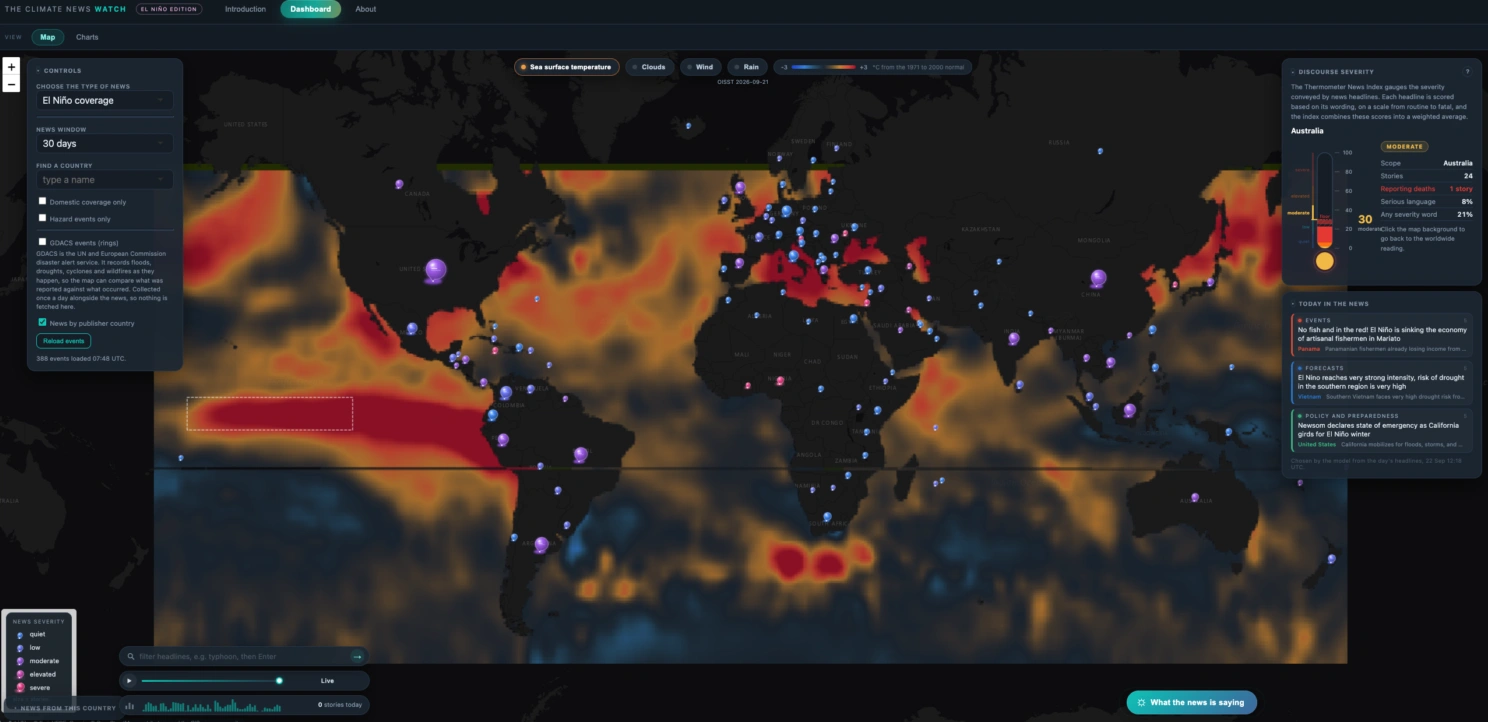
At the centre of the dashboard is an interactive world map filled with coloured circles.
The size of each circle represents the volume of media coverage related to El Niño, while the colour indicates the severity of the discussion. Areas receiving extensive attention appear larger, allowing users to quickly identify where reporting is most concentrated.
The dashboard includes a range of filters and controls that allow users to customise the view.
For example, users can:
- Explore up to 30 days of coverage.
- Focus on reporting from specific countries.
- Compare El Niño reporting with broader climate-related coverage.
- Examine changes over time.
- There are lots of different controls that can give you a more specific view, depending on your needs, Eurico explains.
Comparing reporting with real events
Perhaps one of the dashboard's most interesting and powerful features is its ability to compare media attention with actual disaster events.
An overlay displays records from the Global Disaster Alert and Coordination System (GDACS), a cooperation framework of the United Nations and the European Commission that records and monitors disasters such as floods, droughts, wildfires and cyclones.
When activated, GDACS events appear as green rings on the map. This allows users to investigate whether significant disasters receive extensive media attention or whether some events and regions remain under-reported. This is particularly useful for those studying risk communication and media coverage.
- This comparison allows users to explore the relationship between what happens and what gets reported, says Noleto-Filho.
The disaster data is updated daily alongside the news data, creating a continually evolving picture of disaster events and media attention.
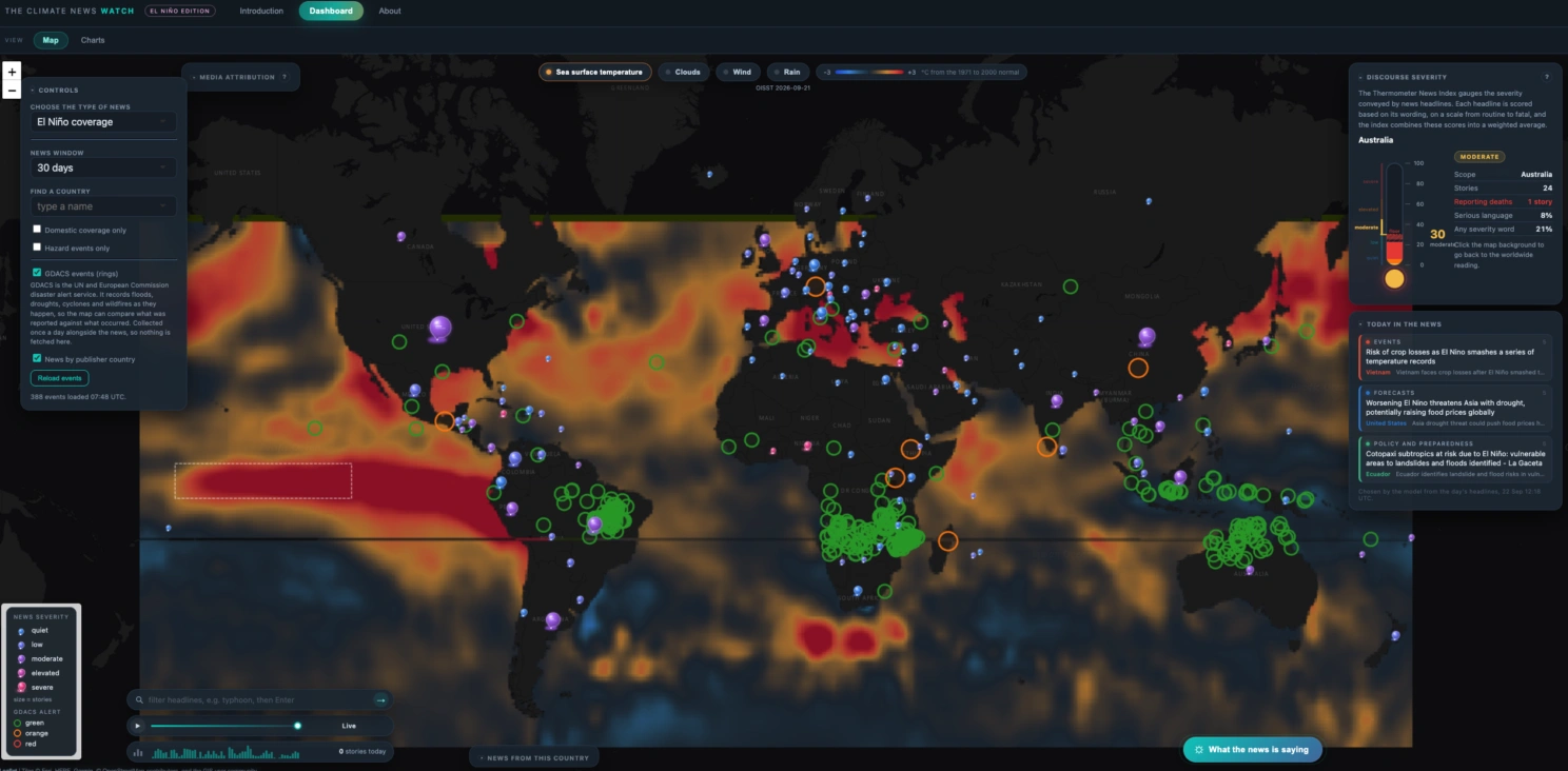
Screenshot of dashboard with GDACS activated.
Climate data at your fingertips
The dashboard goes beyond media coverage and disaster records. Users can add environmental overlays including:
- Sea surface temperature
- Clouds
- Wind
- Rainfall
Multiple overlays can be displayed simultaneously, making it possible to compare different environmental conditions.
For example, users can investigate how sea surface temperature patterns relate to rainfall or compare weather conditions with ongoing media coverage in a specific region.
These features help place news stories within their broader climate context.
Letting AI do the reading
The climate phenomenon is often studied separately from its social and economic impacts, partly because this information is not readily available in structured datasets. Instead, it is scattered across news reports in dozens of languages.
- Today's language models are changing this, says Noleto-Filho.
- They can read this material and automatically organise it into a database that records the country, date, event type, severity, reported deaths and the cause identified in the report itself.
The dashboard has a built-in AI tool that can help make sense of the information. By clicking the button labelled "What the news is saying", users receive a concise summary of recent reporting generated with the help of AI.
The feature scans and distills large volumes of news coverage, helping users quickly identify major themes, emerging concerns and important developments.
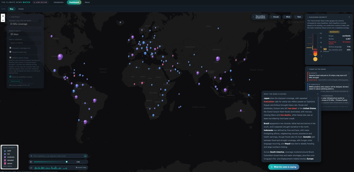
Example of using the AI tool.
Exploring trends in the news
Beyond the map, the dashboard includes a suite of analytical charts designed to help users explore patterns in media coverage.
These visualizations allow users to track:
- Topic dynamics over time.
- Whether journalists attribute events to El Niño or deny those connections.
- The tone used in reporting.
- Frequently used words and themes.
- Cycles of media attention.
- Changes in reported severity.
- Publishing activity across countries and regions.
Together, these tools provide a detailed picture of how El Niño is framed, discussed and understood in media coverage around the world.
Why understanding El Niño matters
El Niño is a naturally occurring climate pattern that develops when temperatures in parts of the tropical Pacific Ocean become warmer than average. Events typically occur every three to seven years and can influence weather patterns worldwide.
Because its impacts are so widespread and varied, communicating those risks effectively is an important part of climate preparedness.
When communities receive timely and accurate information, they are better equipped to prepare for floods, droughts, heatwaves and other climate-related hazards. It is important to understand how those stories are reported, and which stories may be overlooked.
By bringing together media coverage, disaster records and environmental observations in one place, Noleto-Filho's dashboard offers a new way to examine one of the world's most influential climate phenomena.
As the next El Niño unfolds, it provides a window not only into what is happening around the world, but also into how the world is talking about it.
Where the data comes from
News coverage is indexed by The GDELT Project, which monitors media coverage worldwide in more than 100 languages. Disaster records come from the Global Disaster Alert and Coordination System (GDACS), a cooperation framework of the United Nations and the European Commission. GDACS estimates are produced automatically by the Joint Research Centre and are indicative only.
Neither organization is connected with this dashboard or responsible for the analyses and visualizations presented within it.
References
Climate News Watch: El Nino Edition